Audible Mobile Store Redesign


“Trip’s UX leadership on the ground-up redesign of the Audible mobile shopping experience led to a 20% increase in member conversion rate and a 12% increase in revenue, blowing away initial projections by 50% and 375%, respectively.”
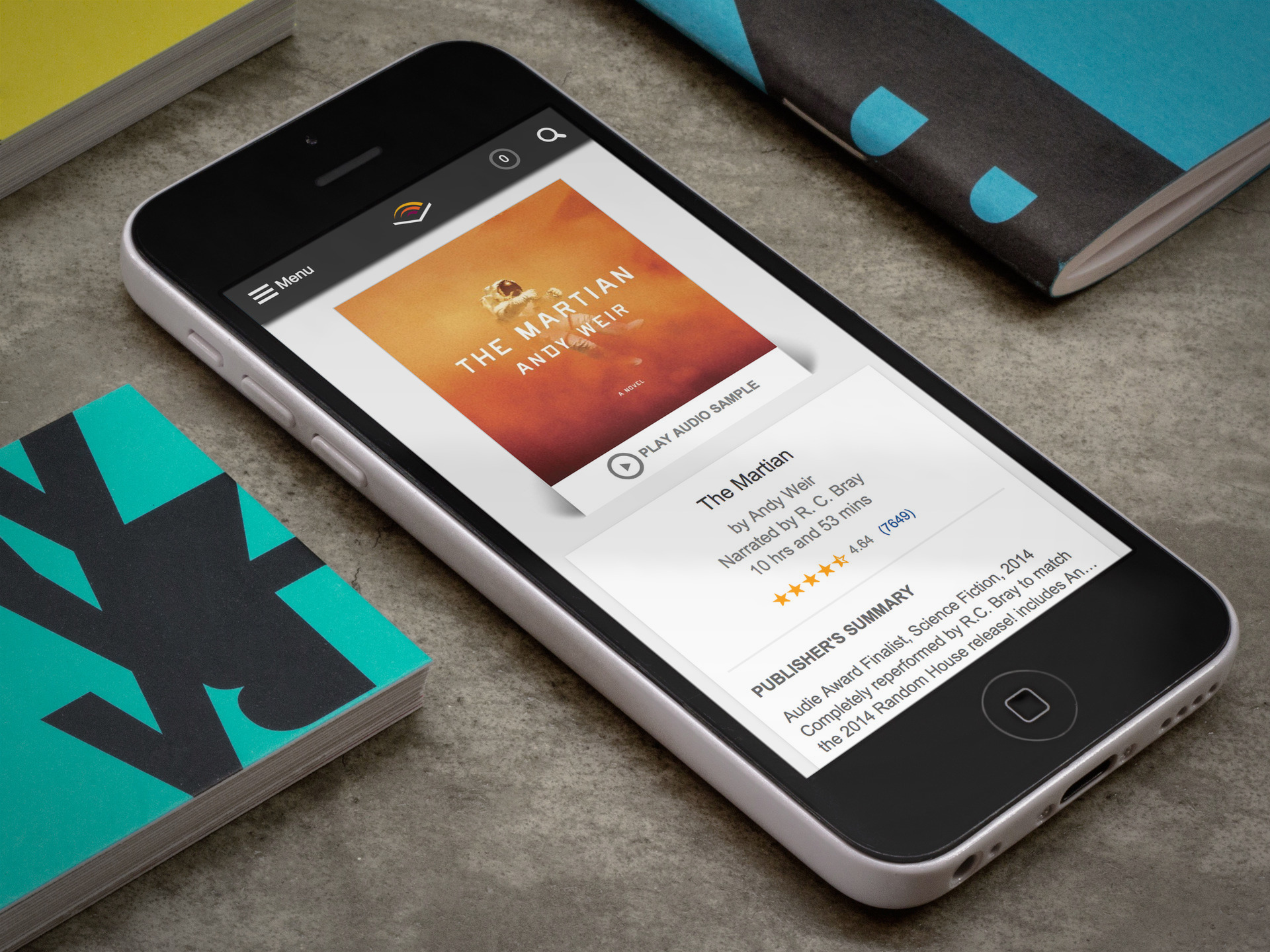
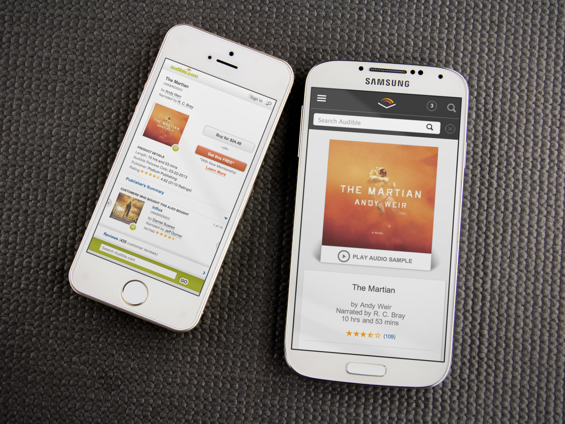
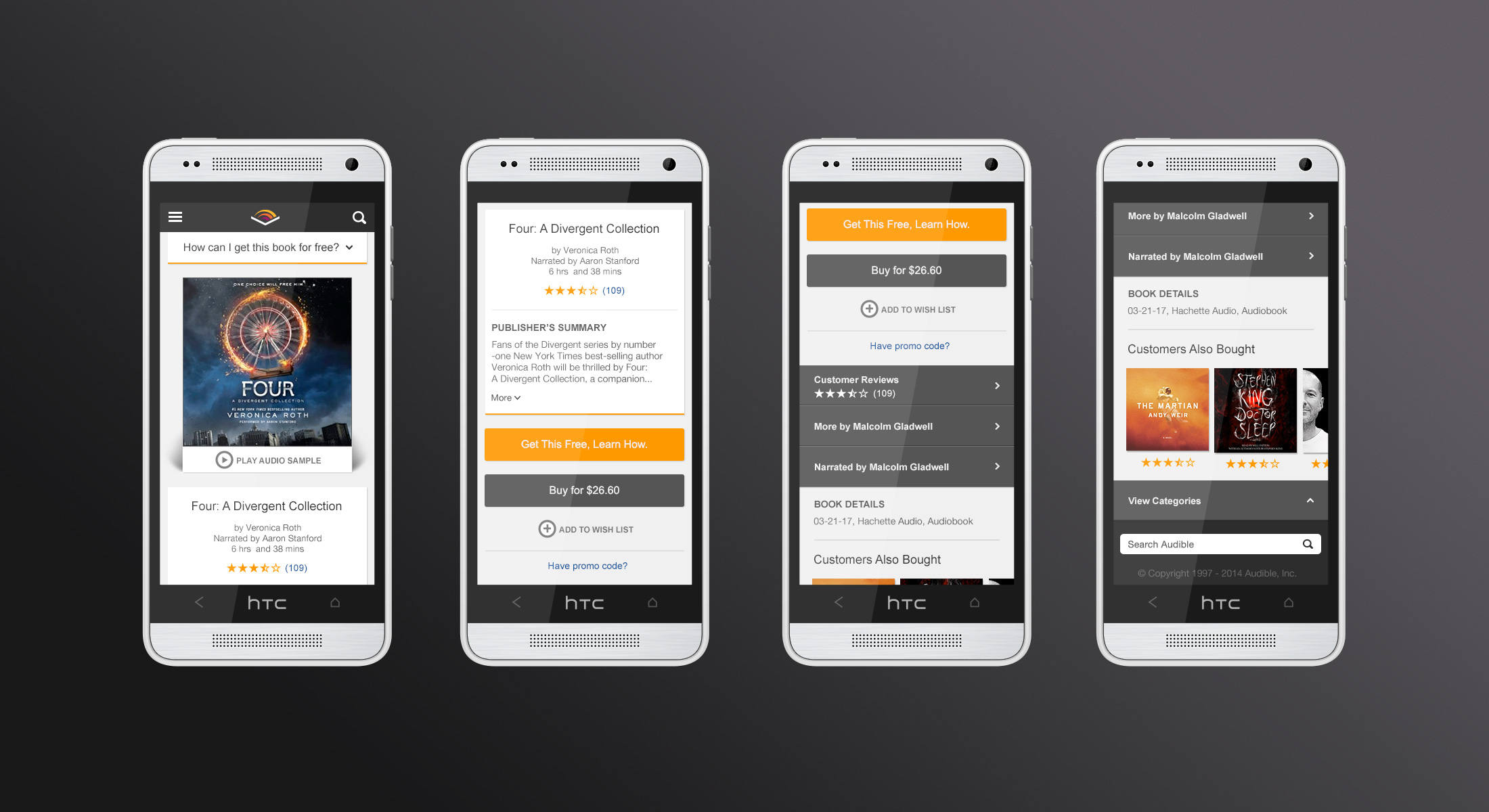
In 2013 I led the ground-up redesign of the Audible mobile store experience. Mobile shopping was rapidly becoming Audible's most important channel, both for purchasing books, but also for new subscriber acquisition.
Redesigning the mobile shopping experience was challenging for a variety of reasons.
It was the most critical sales and conversion channel in the company.
Mobile store touched on almost every part of the business
Attitudes towards how to market to customers were antiquated and stuck in the "sales funnel" mentality of continually throwing offers at a customer until they converted.
The marketing team only cared about lead conversion not the customer shopping experience.
There were constrained resources on design and engineering, and loads of tech debt.
There was the misconception that it was easier and faster to evolve into a design with small experiments rather than start fresh.
I led the design and strategy effort from end to end and started with the following tenets that anchored our work throughout:
The mobile shopping experience will be:
Focused - Every step is essential and goal oriented
Simple - Use cover art to drive to decision points.
Tangible - Trust the scroll, there is no “fold”.
Personal - conform to user tastes, devices and stage of discovery
Honest - Use clear, consistent patterns. Make changes intentional. Don't trick the user into something they aren't ready to commit to.
